Read through the entire brand site to make sure you understand rules, guidelines and how everything works together before using these assets. These assets are only to be used for official GoTriangle communications. Do not use them to promote private businesses or for individual purposes.
If you have any questions or problems as you use these assets, contact Communications and Public Relations at csclark@gotriangle.org.
Style Guide
This style guide, in essence, can be used as a demonstration of current design standards for GoTriangle. It’s style, cleanliness, strength of geometric structure, all lend to the effectiveness of our newly developed brand. Everything from this guide’s speech bubbles to the angled hashing are small details that add personality to the brand and continues the trend of cleanliness and strength.
Do not perceive this guide as rules for rigid design practices, however, do observe it as solid design directions for the brand.
Remember – design rules are meant to be stretched and not necessarily broken. With that being said we do have a few requirements.
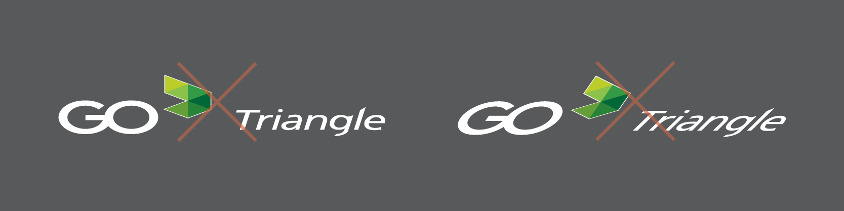
- GoTriangle is to only be used as ONE WORD. Never spaced, "Go Triangle".
- The GoTriangle logo is to not be combined with any other brand in a way that alters its existing identity. Partner logos are to be incoroporated using the methods below.
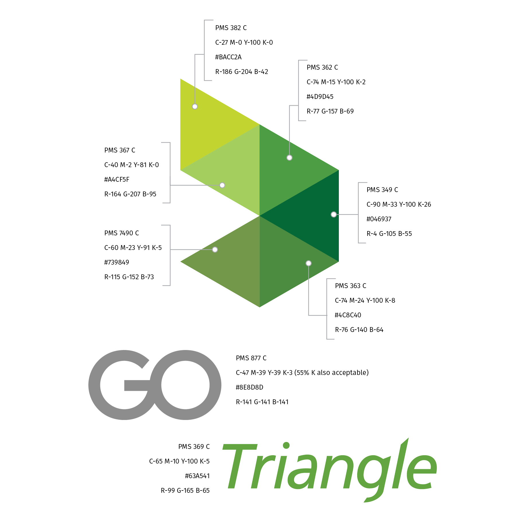
- Do not alter the colors of the flag mark within the GoTriangle logo.
Logo Usage
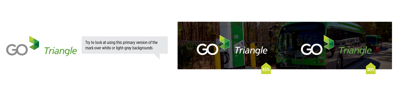
The logo system is great but leaves a lot to be desired in terms of versatility. We have to be careful in the placement of logos adjacent to various colors and/or backgrounds. Because the logo contains both a neutral and a range of colors, placement can be a bit difficult in various media.
Using the reverse versions of the logo work best, especially over active/busy backgrounds, when there is an overly of black (set layer or object mode to “multiply”) with the opacity/alpha set to at least 65%. Selective gaussian blurring of the underlying photo lends to the legibility of the logo and any accompanying text the graphic may contain.
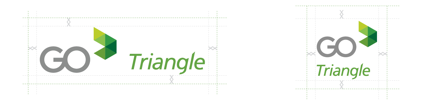
Spacing
Always try to be mentally aware of the negative space around the logos. Spacing tolerances around each logo variation should be no less than two stacked capital X’s at 12pts. This represents the minimal area any encroaching text or graphics are allowed to be in relation to the logo.
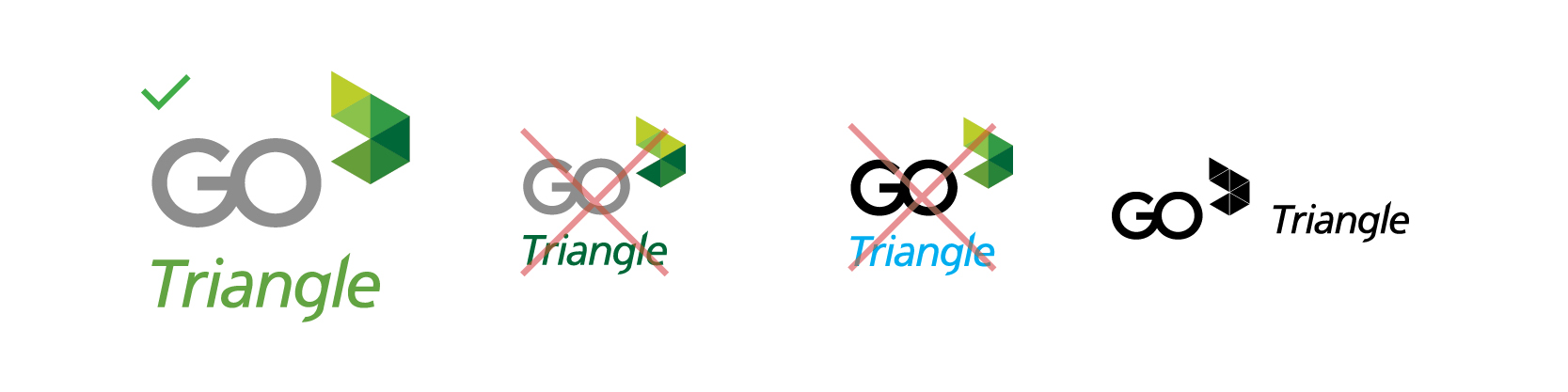
Don't
The one-color version of the logo is to be used only in EMERGENCY situations. Use the one-color only when expressly specified by a printer or a particular printing process as well as physical reproductions of the logo. Our mark was developed to seemingly be only used in full color or greyscale applications primarily. The one-color version does not work simply because the color variations in the “arrow” make up the distinctive elements and presence of the mark and should not be transposed – especially into one color. It loses its personality and just doesn’t....work.
If text or logos or any other graphics are to co-exist with background images, a separation needs to occur. This can be achieved in a number of ways. Drop shadows, dark, light or even colored shapes and boxes can all help achieve the separation to keep images and text legible. Make sure that the logo version chosen is opposite of the object being used to create separation for maximum impact. (ex. If using a black bar/box to create separation, use the reverse version of the logo to create maximum pop and legibility)
Again, be very selective to which version of the logo you select to be applied over background images. The selection to the upper left is a poor choice because A.) It is not the reverse version and B.) The background is too busy for the logo to be clearly legible.

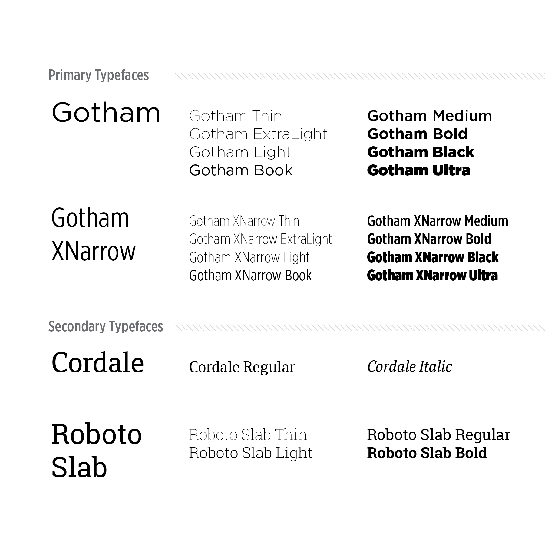
Font Family
Colors